

Data Visualization Techniques
The author's views are entirely their own (excluding the unlikely event of hypnosis) and may not always reflect the views of Moz.
Rob and Duncan are currently in Seattle, with this week full of interviews of SEO consultants for our US office. Since the announcement in February, we have been working flat out with a bunch of new clients and dealing endlessly with the US immigration service. With people on the ground, I guess we're now officially participating in the American dream, so to celebrate I'm going to spell Visualization with a z throughout this post. I can't guarantee full American spelling for everything I'm afraid - muscle memory is a powerful thing.
Anyone who has heard me speak will know about my love of data. Heck, I've even given talks on Excel ninjas. However, this post isn't so much about the data (and that's the last mention of Excel, I promise). This post is about the visualization.
I expect that everyone in SEO has spent at least some time recently thinking about data visualization techniques. They are great ways for content and data sites to get links and branding benefit and are also loads of fun. Tom's resource for information visualization and infographics is a great place to start if you don't really know what I'm talking about.
Last week, I was approached by the FT to pull together some data for them about the use of the web (and social media in particular) across the UK's political parties as we approach the election. As I started thinking about how I wanted to shape this, I realised that I wanted to produce a visualization for the web as well and that the process I was using might be interesting to you guys. Hence, my top tips for data visualizations with bits and pieces of real world examples:
7 Data Visualization Secrets
1. Gather data (intelligently)
Over the weekend, I had a bit of a think about what kind of data I wanted to be able to visualize. Thinking about Twitter, for example, I wanted to know things like the most influential (and least influential) Twitterers in each party, who was doing things really well and who was making a pig's ear of it, who could I compare unfavourably to some comedy joke accounts and how did the best of them compare to the Prime Minister's wife's pretty impressive performance.
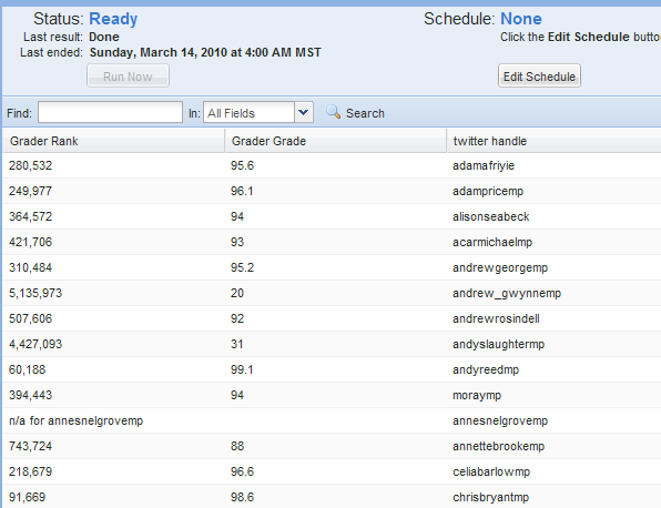
In order to answer any of these questions, I needed data, and lots of it. Obviously, had I been working on this on a weekday, I'd have looked around for the newest recruit in the Distilled office and asked for the data on my desk by the end of the day. Without that option at the weekend, I fired up Mozenda to grab Twittering MPS, their grader ranks, retweetranks, and tweetranks along with follower counts, number of tweets and profile information. It took me about half an hour to gather all this information!
Tip #1: use tools like Mozenda to mash up your own data with multiple sources of public data to get unique insights.
If you haven't played with Mozenda yet, I highly recommend it - with a simple user interface for creating robust crawlers, it's a superb tool for any SEO.
2. Delegate additional research
There are some things that even the best scraping engine in the world can't gather for you. For example, I wanted to cross-reference the data I'd gathered against the cabinet and shadow cabinet. Only a human can do this reliably. For this, I recommend using a virtual assistant service for cheap data gathering (I use timesvr - in the US, you could use mechanical turk for this kind of thing).
I discovered an awesome service the other day - Smartsheet integrates with Google Apps and has an integration with Mechanical Turk that enables you to easily populate tabular spreadsheet data using cheap human resource. Unbelievably useful and powerful.
3. Use great design
I'm not a designer. My design sense is about as well-tuned as my singing. I think this makes me appreciate the importance and value of design even more. Since I'm not the expert here, I'm just going to tell you what works for me when getting other people to make things look pretty:
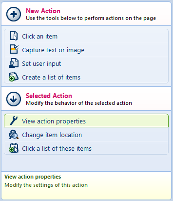
- Wireframes are your friend: although I hate paper for almost everything, I used to always sketch ideas on paper. Recently I have been a late convert to the power of drawing wireframes on the computer. I am, however, definitely sold. Choose your weapon of choice - I'm currently liking MockingBird but have also seen cool stuff from (Balsamiq, gliffy, Pencil (a Firefox plugin - thanks Simon Lilly) and Mockflow)..
- Pay attention to the users of your data: carefully consider the width, colour scheme and any associated links in the embed code to make the most of embedding opportunities
- Get professionals involved early: don't lock your limited-design-skills-self in a darkened room only to emerge with something that even a pro couldn't make look pretty. When you're at the wireframe / outline stage, show what you have to a designer and get feedback before kicking off the final data collection and design phases
- Brief as well as possible: provide a few examples of the style you are looking for and visual elements you particularly like. Include comments about anything you don't like in the examples you provide. Try not to be that guy who says I just don't like it - can't quite put my finger on why...
The example wireframe that follows is for entertainment only. Any relationship to real infographics real or imagined is coincidental:
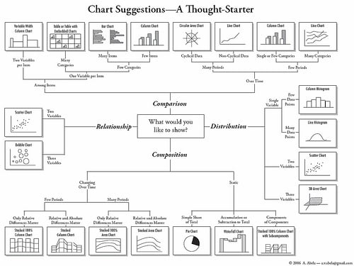
If you are including graph-based data, choose your charts carefully (tip: pie charts are often bad). I found this neat flow-chart for choosing what style of graph to use the other day - from Advanced Presentations by Design by Andrew Abela:
4. Consider interactivity for widgets
Any time you are working with data online, you have opportunities to provide your users with interactivity. Sometimes, static infographics are plenty enough to get links and sometimes you will get significantly more if you are providing a widget that allows people to offer their visitors interesting functionality.
You don't always have to build this yourself. We recently started working with Tableau Software whose business intelligence software has a kick-ass free, public version that is really cool for just dropping in data and creating widgets for embedding. Here's a subset of the UK politicians on Twitter data:

5. Quirky is at least as important as correct
You all read the internet. You know the power of random facts, cute animals, in-jokes and comedy references. It's generally not enough to present just the raw facts - interesting comparisons and strong imagery improve the shareability of any piece. We are all wired to remember (and therefore to repeat) comparisons better than plain numbers.
I'm still working on which elements of my infographic might make for quirky comparisons. For example, did you know that an Oscar is the same height as an adult pygmy marmoset monkey? From a client's recent Oscars infographic:
")
Source: LocateTV
6. Know who your targets are
Finishing on a couple of strong SEO points, if your goals are improved rankings, you are doing this primarily for links (and if you are doing it for branding purposes, the sharing is critical). So you need to know who your targets are and find a way to reach them. If your target market happens to overlap with Reddit, StumbleUpon etc. then they are obviously going to be great, but don't forget to drop people in your niche a line as well.
Bonus tip: don't forget the infographic fans.
7. Provide the embed code (with a link)
You want to provide the embed code for two reasons:
- to make it easy for non-tech-savvy bloggers to share your content
- to make sure (as far as possible) that you get a link out of it
If you can style and include the link in a relevant way (especially if it links to more data or more information) you increase the chance that the people embedding your content will embed the link along with it. If you want to go even further, you could provide your graphic under a Creative Commons Attribution license.
Please keep the comments for discussions of techniques and ideas, not for politics. Any political comments included above are for amusement only and may or may not reflect the political views of the author, or anyone else.


Comments
Please keep your comments TAGFEE by following the community etiquette
Comments are closed. Got a burning question? Head to our Q&A section to start a new conversation.