
Don't Fall Into the Trap of A/B Testing Minutiae
The author's views are entirely their own (excluding the unlikely event of hypnosis) and may not always reflect the views of Moz.
Jason Cohen recently authored a post on A/B testing that deserves both broader awareness and a deeper dive. Most of us in the online marketing world are aware of the power A/B tests can bring through improved click-through, sign-up and conversion rates. Getting a higher percentage of visitors to a page to take a desired action is powerful stuff.
The process by which we hypothesize, design, create and run testing, however, is fraught with peril. And, one of the least obvious, but most insiduous potential pitfalls is actually what we choose to test.
Visualizing the "Local Minimum" Issue
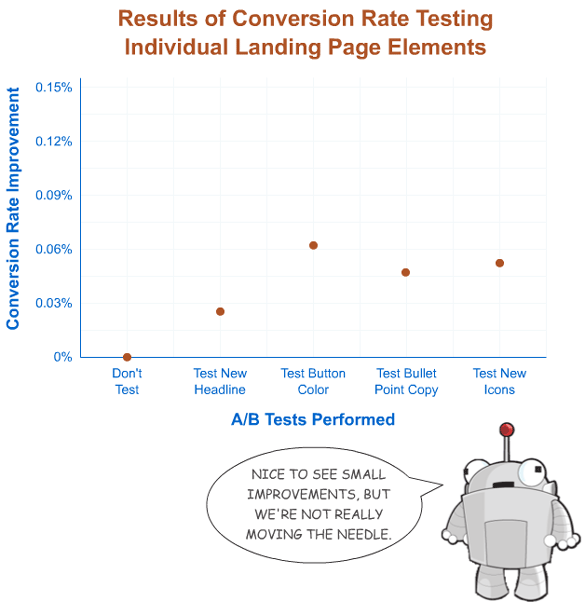
It's definitely interesting and sometimes worthwhile to test individual elements of a landing page, but it's often not appropriate at the beginning of a landing page or product's life. As Conversion Rate Experts points out, the "let's throw stuff at a wall and see what sticks" approach can have a small impact. Researching the questions visitors have and answering them effectively can make a world of difference.
The problem is, it's so very tempting to be seduced by an easy answer.
The Tantalizing Tease of Testing Minutiae
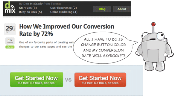
It's likely that many of you have read case studies like the ones below:
- Changing Button Color from Red to Green = 72% Improvement from Dan McGrady
- 11% Conversion Rate Increase with a "Commitment Checkbox" from Conversion Voodoo
- How Adding "It's Free" Increased Conversion by 28% from Soocial
- Human Photos Double Conversion Rate from Carsonified
- The infamous Twitter Following Command Test from Dustin Curtis
In all of these, some simple change accounted for big increases in click-through or conversion rate, leading to widespread praise and sharing. The problem is - they're the exception, not the rule. In fact, that's precisely why they're newsworthy and get so many mentions. That's not to say you shouldn't read them or shouldn't take away value from the examples (you definitely should). It's just that the mentality of the small change can create a misleading mindset for marketers.
Very few websites have the experience of changing a button color or altering a headline or fiddling with some copy and seeing huge improvements in conversion rate. If you have good reason to believe you're an outlier, go for it, just be cautious - it's not just the fact that small scale changes can have less positive of an impact. They also cost time and resources that you can't afford.
Some Simple, Compelling Math to Keep You Out of the Weeds
Let's say you're pretty good at conversion rate optimization - A/B and multivariate tests are relatively easy for you to perform and you've got solid instincts around them. And let's also say that you get reasonably decent traffic to your landing/test pages - in the several thousand range each day.
Even under these ideal conditions, massive problems emerge.
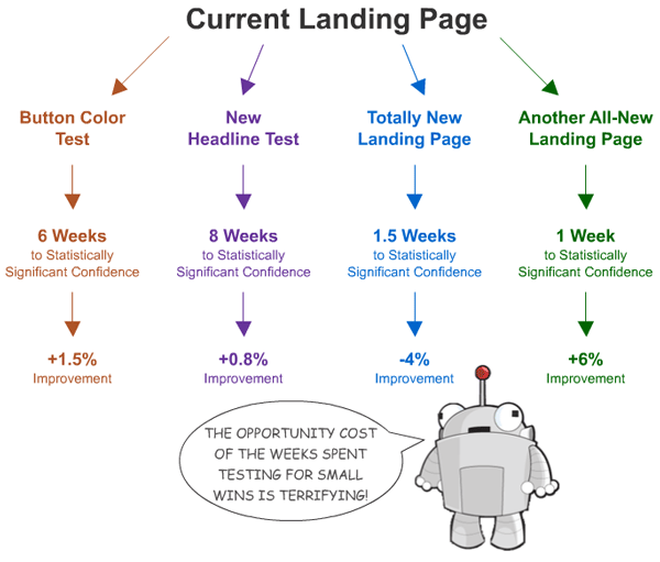
Knowing that each test takes a substantial amount of time to get high confidence of accuracy and that smaller tests (with less needle-moving potential) take MORE time is a pretty convincing reason to start out with the big ideas and big changes first. But, it's not the only logic behind this. Let's say you find a page/concept you're relatively happy with and start testing the little things - optimizing around the local minimum. You might run tests for 4-6 months, eek out a 5% improvement in your overall conversion rate and feel pretty good.
Until...
You run another big, new idea in a test and improve further. Now you know you've been wasting your time optimizing and perfecting a page whose overall concept isn't as good as the new, rough, unoptimized page you've just tested for the first time.
It's easy to see how you can get lost in this process and frustrated, too. That's why my recommendation (and the advice I get from lots of talented CRO folks) is to start with the big ideas and big projects, nail down the grand plans worth testing, let your audience pick a winner and then try to tweak, tune and improve.
What You Should Be Testing
What do I mean when I say "big ideas" and "overhauls?" Luckily, 37Signals provided a terrific example yesterday with their Basecamp Homepage Redesign:
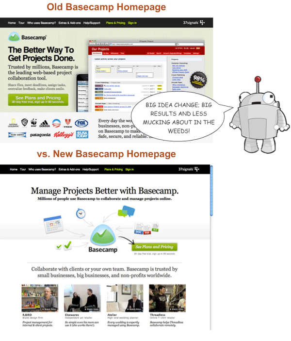
They recorded a 14% improvement from new vs. old and can now decide whether they want to try another innovative concept or start optimizing the little things on this version. And while the numbers don't sound as compelling as a few of the bigger ones from the small tests, I'd argue they're going about things exactly in the right way. Perhaps a "little change" to the old version would have improved things quite substantially, but with this new version, they've got a higher base conversion rate and can benefit from every change that much more.
Another great example is the case study Conversion Rate Experts did for SEOmoz itself. That test gave us a 52% improvement in conversion rate from the PRO landing page. As an addendum, in April of this year, we tested an in-house created, shorter, less story-like landing page that we all hoped would beat out the old long-form version. After a few weeks of testing, it lost out. Later this summer, we'll be trying something completely different in an attempt to beat our current best.
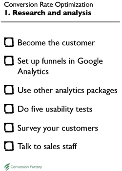
The process to follow for conversion rate optimization and testing was well described in Stephen Pavlovich's post - The Definitive How-to Guide for CRO. His PDF guide, in particular, made this dead easy:
Follow those steps, don't get lost in the minutiae, and you'll be on your way to exceptional results - no thousand monkeys with typewriters required.
p.s. I'd also suggest checking out this long but worthwhile post on stats for usability (and A/B) tests.



Comments
Please keep your comments TAGFEE by following the community etiquette
Comments are closed. Got a burning question? Head to our Q&A section to start a new conversation.