

Your Users Aren't Intuitive, Which is Why Your Forms Need to Be
The author's views are entirely their own (excluding the unlikely event of hypnosis) and may not always reflect the views of Moz.
For SEM Tuesday I'm cheating a little and talking about forms and usability; however, if you have a sign up form or some sort of registration on your landing pages, this is sound advice that ties in well.
In an attempt to be hardcore in 2008, I decided, at Christine's insistence, to sign up for the New Balance Half Iron Man in Victoria, BC. Christine, Manstery Guest, and I are going to swim, bike, and run until we puke. Fun times! I went to the sign up page, filled out the information, and submitted my form. Upon looking at my form results, I noticed some errors that I made, but I didn't catch any of them until after I had submitted everything.
The first errors I made are highlighted below:
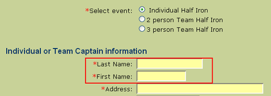
I automatically assumed that the fields were first name THEN last name, not last name/first name; thus, I registered as "Kelley Rebecca." I got this lovely confirmation email stating as such:
.gif)
And then someone emailed me with this:
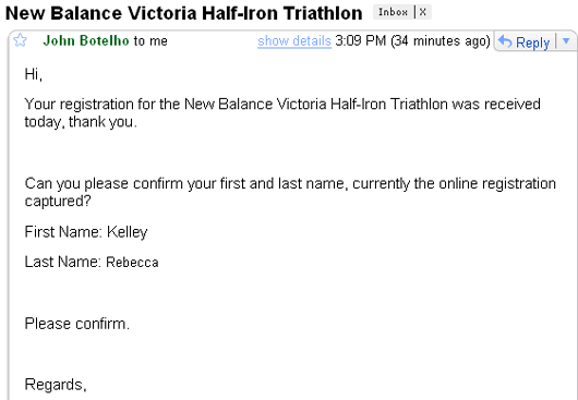
Wow, I sure do look like an idiot. Nevertheless, I intuitively thought that the form would go "First/Last," so I hastily filled it out that way and it ended up being wrong.
Second issue with the form:
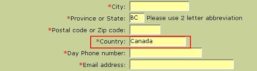
It auto-filled "BC" and "Canada" for the Province and Country information, even though I'm from Seattle, WA. I actually correctly typed in both the city and state, but I overlooked the Country field, so I registered as Kelley Rebecca from Seattle, WA Canada. Grrrrr...
Next issue:

I have absolutely no idea what my estimated swim time would be for 1.2 miles. I haven't swum further than six laps in a most-likely non-regulation size swimming pool my freshman year of high school (so, ten years ago). I turned to Jane, Ms. Fancy Pants Collegiate Swimmer, for a ballpark figure. She was of no help whatsoever:
Rebecca: dude, I have no idea! what's a non-FreakShowCopland swim time for that distance
jane.copland: for an hour?
Rebecca: no, for 1.9 km
jane.copland: like, how far can you swim in an hour? oh
Rebecca: distance
jane.copland: um
Rebecca: I'm signing up for that half iron man and they need an estimate of how long it'll take me to swim that far
jane.copland: well... hmm 2km. So the fastest i could swim that at my best would be about 25 minutes...so
Rebecca: well eff you!
Most people probably don't know the exact time in terms of hours and minutes of how long it takes them to swim that distance, so I'd recommend offering responses that range from X to Y, e.g., "0-25 minutes, 25-40...etc." It would be easier to sort responses into group times, too, rather than going through each individual answer and sorting it into "Slow as Hell," "Average," "Above Average," and "Copland Speed" categories.
Moving onto the next one:
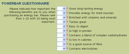
Okay, is this 1 to 10 in order of importance, meaning that each answer only has one number assigned to it, or can I score multiple answers with a 10? This wasn't made clear to me, so I just randomly scored my responses and didn't put any of them in order.
Next:
Upon reviewing my completed form and the answers, I saw that my responses for the Medical Questionnaire section were cut off once I typed past the little text box. I wrote something along the lines of "Seasonal allergies; currently on medication (Flonase, Allegra) and allergy injections," and the form, in a somewhat comical manner, only caught "Seasonal allergies; currently on medication" (WHAT MEDICATION?!! NOOOOOOOO!).
Next up is this section:

Where are these training clinics held? There is absolutely no further information about the clinics other than "Would you like to join--if so, $95, please." I'm assuming that the clinics are held somewhere in Victoria, so no, I don't want to sign up for them. If there were local ones in Seattle, perhaps I would, but introducing completely new information halfway down the form without any sort of clarification is confusing.
I went back to the form and tried to intentionally break it--I first hit "Submit" without filling out any of the information. I received a notification to "Please Enter your last name. Use Your browser's back button to return to the form page" (weird capitalization kept intact). I hit the back browser, entered only my last name, and resubmitted the form. The next error message I got was, you guessed it, "Please Enter your first name..." You're kidding me--each error is brought up only one at a time? What a frustrating, slow procedure for the user. Something more standard would be to take the user back to the form, highlight the missing or incorrect information in red, and display a message that says "Please fill out the information highlighted below," or something to that effect.
Not to toot my own horn, but I'd say that I'm an above-average user, so for me to get tripped up on some of the triathlon signup form elements is pretty bad. Now, you could argue that I just flew through it and didn't notice the subtle changes here and there and the non-standard format, but I'd argue that so will plenty of other users, too. This is where I highlight the title of this post: your users aren't intuitive, which is why your form needs to be. Keep things standard--don't put information out of order, don't auto fill fields unless they're fields that users had already filled in at a previous stage, and don't make assumptions about your user. I usually see forms list your first name first. I am not from Canada. I have no clue how fast I swim. I'm not sure how to order my power bar preferences. I have allergies, and it would be beneficial for you to know what medication I'm taking for said allergies. I am confused about your cryptic coaching clinics. And I don't want to keep hitting the back button to fix my errors one at a time until they're all correct.
Anyway, this post was full of a lot of "Don'ts" and not as many "Do's," and I'll be happy to author a separate post on how to make as user-friendly a form as possible, but for now this has gotten a bit lengthy so I'll drop a few links on how to create great web forms, tips for boosting web form conversions, and a checklist of what makes a good form. In the meantime, I'll leave you with a mental image of Kelley Rebecca from Seattle, WA Canada, floundering in a lake and cursing Jane for her built-in gills and webbed toes. Man, that'd make for a good cartoon...
In an attempt to be hardcore in 2008, I decided, at Christine's insistence, to sign up for the New Balance Half Iron Man in Victoria, BC. Christine, Manstery Guest, and I are going to swim, bike, and run until we puke. Fun times! I went to the sign up page, filled out the information, and submitted my form. Upon looking at my form results, I noticed some errors that I made, but I didn't catch any of them until after I had submitted everything.
The first errors I made are highlighted below:
I automatically assumed that the fields were first name THEN last name, not last name/first name; thus, I registered as "Kelley Rebecca." I got this lovely confirmation email stating as such:
And then someone emailed me with this:
Wow, I sure do look like an idiot. Nevertheless, I intuitively thought that the form would go "First/Last," so I hastily filled it out that way and it ended up being wrong.
Second issue with the form:
It auto-filled "BC" and "Canada" for the Province and Country information, even though I'm from Seattle, WA. I actually correctly typed in both the city and state, but I overlooked the Country field, so I registered as Kelley Rebecca from Seattle, WA Canada. Grrrrr...
Next issue:
I have absolutely no idea what my estimated swim time would be for 1.2 miles. I haven't swum further than six laps in a most-likely non-regulation size swimming pool my freshman year of high school (so, ten years ago). I turned to Jane, Ms. Fancy Pants Collegiate Swimmer, for a ballpark figure. She was of no help whatsoever:
jane.copland: for an hour?
Rebecca: no, for 1.9 km
jane.copland: like, how far can you swim in an hour? oh
Rebecca: distance
jane.copland: um
Rebecca: I'm signing up for that half iron man and they need an estimate of how long it'll take me to swim that far
jane.copland: well... hmm 2km. So the fastest i could swim that at my best would be about 25 minutes...so
Rebecca: well eff you!
Moving onto the next one:
Okay, is this 1 to 10 in order of importance, meaning that each answer only has one number assigned to it, or can I score multiple answers with a 10? This wasn't made clear to me, so I just randomly scored my responses and didn't put any of them in order.
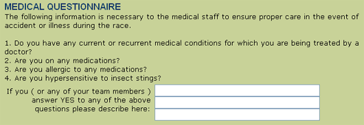
Next:
Upon reviewing my completed form and the answers, I saw that my responses for the Medical Questionnaire section were cut off once I typed past the little text box. I wrote something along the lines of "Seasonal allergies; currently on medication (Flonase, Allegra) and allergy injections," and the form, in a somewhat comical manner, only caught "Seasonal allergies; currently on medication" (WHAT MEDICATION?!! NOOOOOOOO!).
Next up is this section:
Where are these training clinics held? There is absolutely no further information about the clinics other than "Would you like to join--if so, $95, please." I'm assuming that the clinics are held somewhere in Victoria, so no, I don't want to sign up for them. If there were local ones in Seattle, perhaps I would, but introducing completely new information halfway down the form without any sort of clarification is confusing.
I went back to the form and tried to intentionally break it--I first hit "Submit" without filling out any of the information. I received a notification to "Please Enter your last name. Use Your browser's back button to return to the form page" (weird capitalization kept intact). I hit the back browser, entered only my last name, and resubmitted the form. The next error message I got was, you guessed it, "Please Enter your first name..." You're kidding me--each error is brought up only one at a time? What a frustrating, slow procedure for the user. Something more standard would be to take the user back to the form, highlight the missing or incorrect information in red, and display a message that says "Please fill out the information highlighted below," or something to that effect.
Not to toot my own horn, but I'd say that I'm an above-average user, so for me to get tripped up on some of the triathlon signup form elements is pretty bad. Now, you could argue that I just flew through it and didn't notice the subtle changes here and there and the non-standard format, but I'd argue that so will plenty of other users, too. This is where I highlight the title of this post: your users aren't intuitive, which is why your form needs to be. Keep things standard--don't put information out of order, don't auto fill fields unless they're fields that users had already filled in at a previous stage, and don't make assumptions about your user. I usually see forms list your first name first. I am not from Canada. I have no clue how fast I swim. I'm not sure how to order my power bar preferences. I have allergies, and it would be beneficial for you to know what medication I'm taking for said allergies. I am confused about your cryptic coaching clinics. And I don't want to keep hitting the back button to fix my errors one at a time until they're all correct.
Anyway, this post was full of a lot of "Don'ts" and not as many "Do's," and I'll be happy to author a separate post on how to make as user-friendly a form as possible, but for now this has gotten a bit lengthy so I'll drop a few links on how to create great web forms, tips for boosting web form conversions, and a checklist of what makes a good form. In the meantime, I'll leave you with a mental image of Kelley Rebecca from Seattle, WA Canada, floundering in a lake and cursing Jane for her built-in gills and webbed toes. Man, that'd make for a good cartoon...


Comments
Please keep your comments TAGFEE by following the community etiquette
Comments are closed. Got a burning question? Head to our Q&A section to start a new conversation.